Character Illustrations:
|
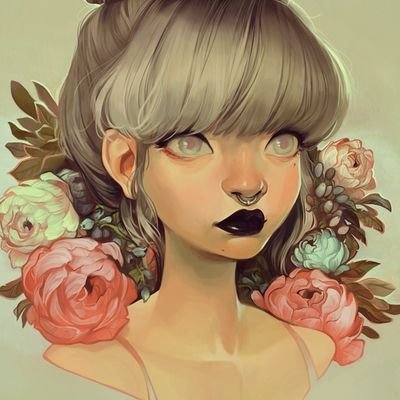
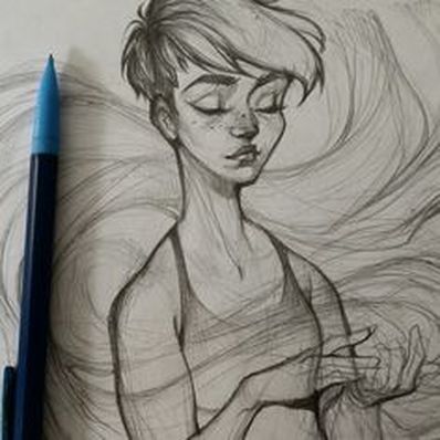
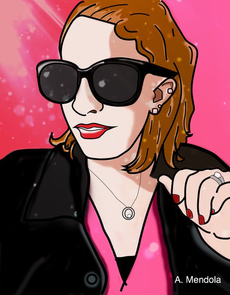
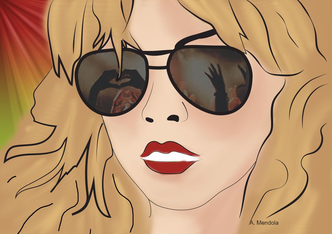
Since prehistoric times, people have used illustrations as a form of communication to express the world around them. Throughout the years, illustrations have progressed thanks to education, resources, and technology. To create an illustration, people take objects, including people, from real life and draw them in a simplified way, focusing on the prominent contours, or the main lines of the object being drawn. While doing this, artists add their own styles to their illustrations, creating a stylized version of the object being drawn. When artists stylize their illustrations, they are making the illustration recognizable but not realistic using their own creative touches. Artists can stylize their art via line quality, such as the weight (thickness) of the line or the type of line being used (broad to thin, thin to angular), color choice, use of shapes, etc. All of these artistic choices that are made during the creation process allow the illustration to be more visually appealing, create movement, texture, and depth or dimension.
|
|
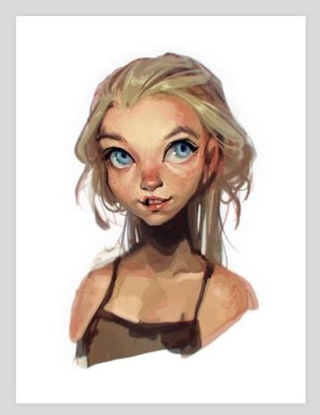
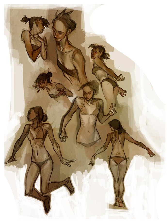
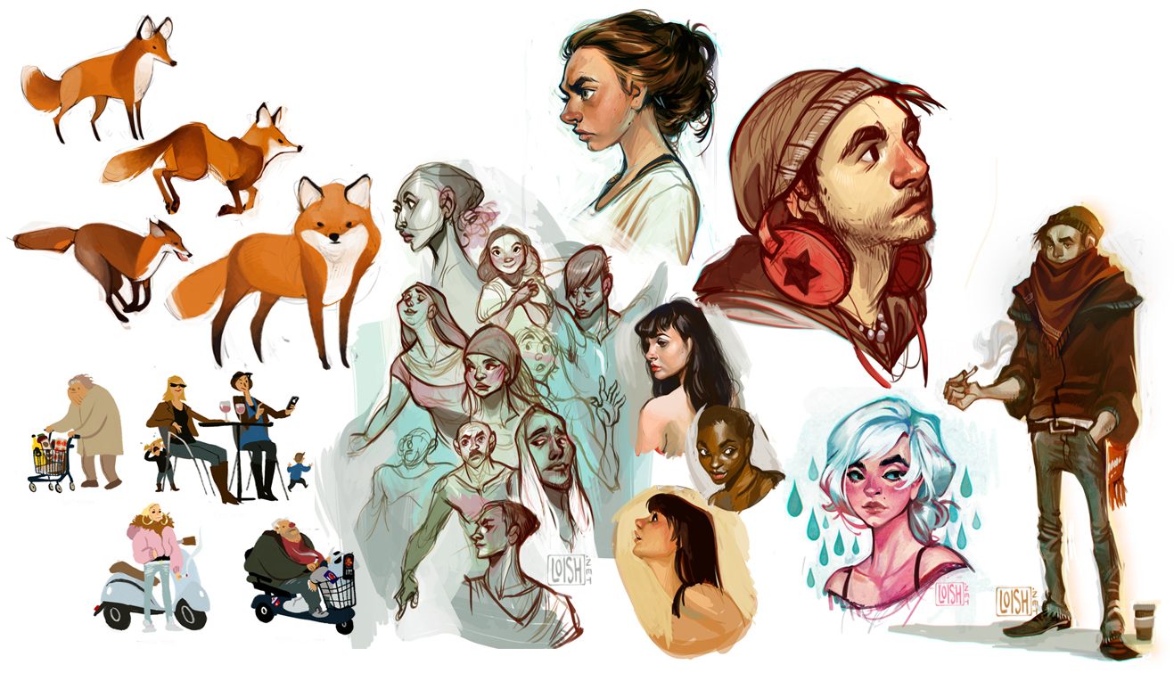
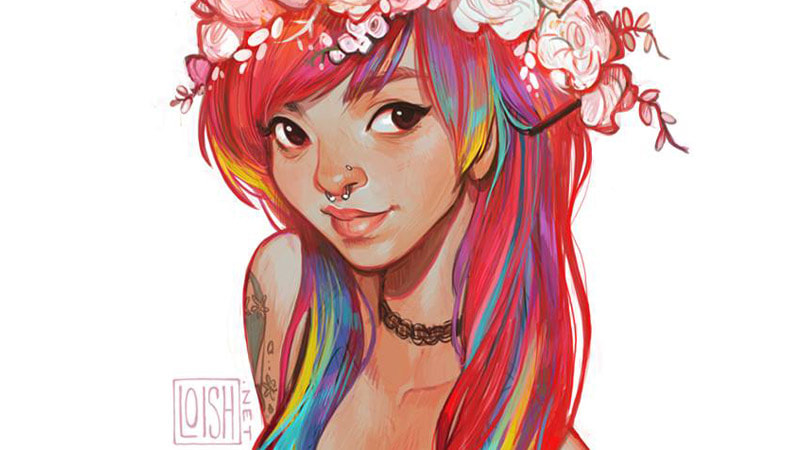
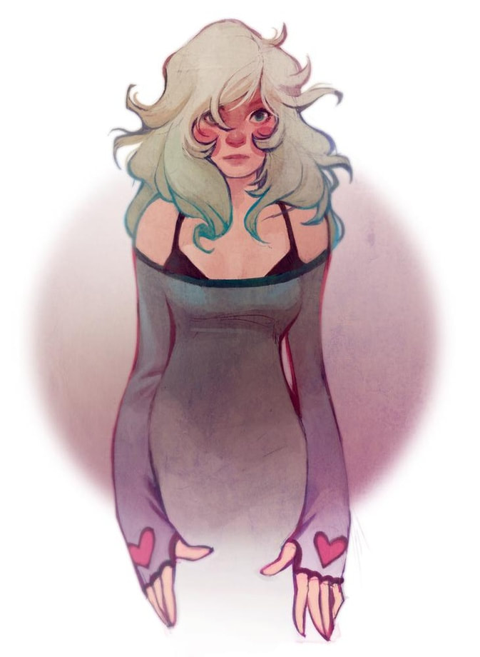
Lois van Baarle
Lois van Baarle is a contemporary, female artist from Holland. Following her high school school career, she studied animation in Belgium for a year, moved back to Holland and continued her studies there. Lois Van Baarle uses Adobe Illustrator and Photoshop, along with her drawing tablet to create illustrations such as the ones below. The video shows a time lapse of her illustration process.
|
|
|
|
|
|
Tutorial: Rubric:
|
| ||||
|
|
Reflection Questions:
All questions are to be answered in complete sentences next to your final project in your Google Digital Art Portfolio:
1. What do you think is the most successful part of your project and why?
2. What do you think could use improvement or have been done more creatively? Explain your answer.
**** (I will not accept answers of I don't know or Nothing)****
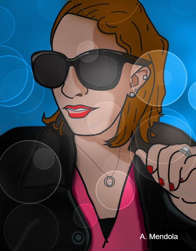
3. Explain the background image or color you chose for your illustration? For example, I chose a pink gradient to match the color of my shirt and makeup. I then added an overlay affect to add an illusion of light shining down on me)
1. What do you think is the most successful part of your project and why?
2. What do you think could use improvement or have been done more creatively? Explain your answer.
**** (I will not accept answers of I don't know or Nothing)****
3. Explain the background image or color you chose for your illustration? For example, I chose a pink gradient to match the color of my shirt and makeup. I then added an overlay affect to add an illusion of light shining down on me)